How to properly set up black elements and areas
Black is a widely used color in graphic design, as its characteristics can be useful in terms of contrast, weight, and strength. However, black can also cause a lot of trouble during printing, due mainly to errors in the settings of editing programs.
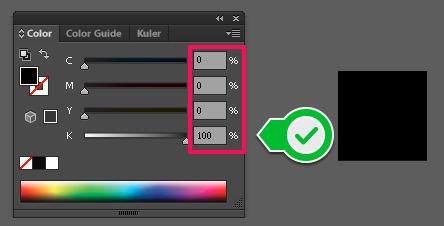
For text, thin lines, and small elements, always make sure you use pure black, i.e. Black (K) set to 100%, while the three other colors (C, M, and Y) are set to 0%.

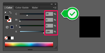
For larger areas and elements, use a composite form of black, i.e. Cyan ( C )= 30%, Black (K) = 100%, and Magenta (M) and Yellow (Y) = 0%.

These instructions apply to any image editing program (Adobe Photoshop, Adobe Indesign, etc.), although they were originally made in Adobe Illustrator. This is because color palettes work the same way in any program.


