One of the main selling points of print materials is that you can endlessly customize everything about it: colours, images, their position in the artwork, text, fonts, etc. The way in which you choose to combine these elements will render your print unique, and ideally will convey a clear message to readers. As such, the fonts you decide to use and the way in which you do so can make or break your print.
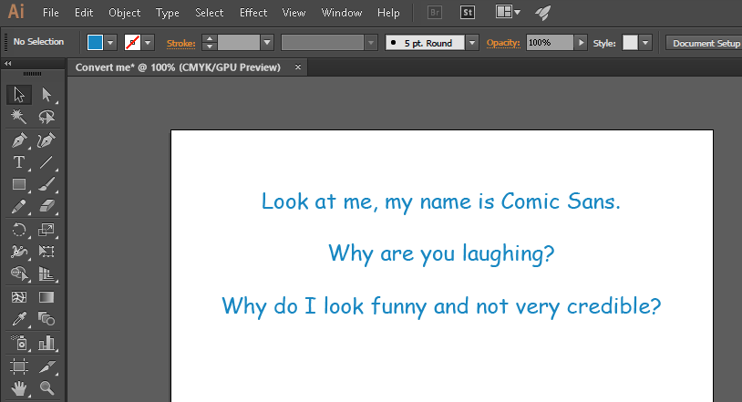
For instance, if you are advertising your state-of-the-art technology consultancy, it might be best not to use Comic Sans as a font in your printed promotionals (or anywhere actually, for any purpose, unless you’re designing a ToysRUs catalog for kids). I’m bringing up the Comic Sans example because it highlights that although fonts are often taken for granted, they can have an important impact on the credibility/attractiveness of your print and its message. Indeed, the feel and emotions that your print ad brings up in people needs to match your company’s brand image as closely as possible. It is crucial that the message that you try to get across and the font you are using match each other, are in line. You can browse Fontfont’s catalog for an idea of the (extensive) choice that you have, and to find the font that is most appropriate for your needs.

So the first important step regarding fonts is to choose the one that will make your print stand out, and reinforce its main message while reflecting your company’s image. A variety of mainstream fonts are supported by most (or all) of the available editing software, but there are at least as many fonts that are unique and not so widespread. The problem with using such niche fonts is that although you downloaded them and can use them on your computer, this won’t be true for many other computers. The quite annoying outcome of this is that compatibility issues emerge, causing editing and printing problems with the printing company that you employ the services of.
The way around this is to always convert the fonts in your artwork to outlines, to ensure 100% compatibility. Once you are satisfied with the look of your artwork, save the final version without converting the fonts. This is important because once you have converted fonts to curves, you will not be able to edit texts any further, and as such there is no way back. Once you have done this, convert the fonts and save the file under a new name.
Depending on the editing software that you fancy most, the process of changing your fonts to curves is slightly different. However, the main steps remain the same:
1. Find all the fonts in your artwork file, and locate all the places in which they are used
2. Select them one by one, and convert the fonts to outlines/curves, using your editing software’s dedicated function
For a step-by-step and illustrated explanation of the process in Adobe Illustrator, refer to our tutorial on Checking and Changing your Font Settings
Converting all the fonts that you use in your artwork file to curves ensures that there will be no displaying/editing/printing issues with your file when it is transferred to another computer. That way, there can be absolutely no issues with and printing your artwork file, even if you are the only person to use a specific font (that you might have even designed)
Stay tuned for more printing tips and news on the Gogoprint blog! Oh, and don’t forget to share our blog posts with some of your friends and/or business connections with an interest in graphic design and/or printing!


